CLICKS TO BRICKS: Wayfair opens its first-ever physical retail store in Wilmette, IL
- chelseyb6
- May 31, 2024
- 2 min read
Our team was in the field this week scoping out the latest "Clicks to Bricks" venture from home goods & furniture giant, Wayfair. Since its founding in 2002, Wayfair has operated exclusively as an e-commerce platform with five branded sites: Wayfair, Joss & Main, AllModern, Birch Lane, and Perigold. This year, Wayfair announced they'd be joining other Direct-to-consumer brands like Warby Parker, Glossier, and Everlane in opening physical stores. The company's first ever brick-and-mortar location opened last week in Wilmette, Illinois, and we couldn't wait to check it out!
Here are our team's observations:
BRIGHT + AIRY AESTHETIC
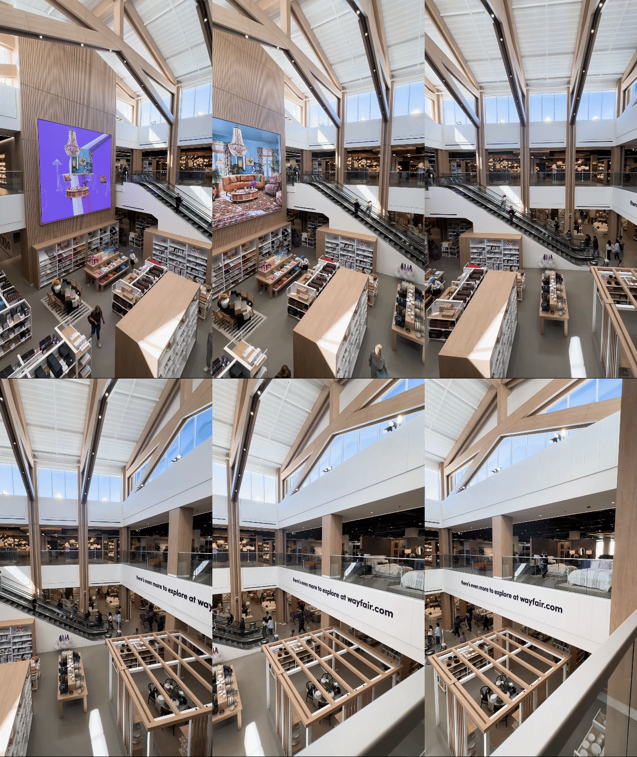
Upon entering, we were greeted by a stunning atrium filling the space with abundant natural light and a sense of openness. The store, spanning two levels, is arranged into distinct categories, including kitchen, bath, bedroom, office, outdoor, carpet/flooring, hardware, appliances, and more.
BRAND PRESENCE
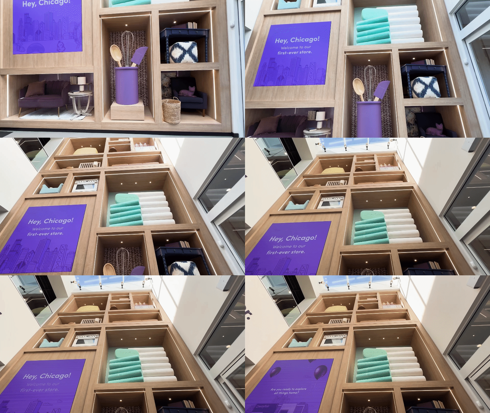
Throughout the store, a blend of light wood and white materials creates a cohesive aesthetic, punctuated by accents of the iconic "Wayfair purple." This signature color is sprinkled into displays, props, wallpaper, and graphics, lending a consistent look and feel to the entire space.
A+ for WAYFINDING
Navigating the store is effortless, thanks to the meticulously crafted signage in each section, designed to assist customers in finding their desired products. For instance, a display labeled "Choose Your Custom Cabinets" uses graphics and physical samples to walk customers through selecting door styles, paint/stain options, and construction materials, ensuring a personalized shopping experience.
EFFECTIVE USE OF DIGITAL
The store makes an excellent departure from Wayfair's digitally native roots. It can be tempting to over-use digital, which can overwhelm shoppers. We were pleased to see screens used minimally and effectively. A few video screens are placed strategically in the entrance and atrium to display eye-catching videos, and digital price tags are well utilized throughout the vignettes and displays.
"TEST THE REST" EXPERIENCE
One of our favorite areas of the store was the mattress room. Nestled in the bedroom section, this separate room had a much different look and feel. The walls were painted a deep blue, and they had calming spa-like music playing to sell the comfort and relaxation of the mattresses. Graphics on the walls and fixtures invited shoppers to explore mattress, pillow and duvet options to find "your perfect sleep setup".
Stay Tuned for More
As specialists in retail design, we understand the importance of keeping our finger on the pulse of the latest trends and store openings. These field trips provide us with fresh insights and ideas that we can incorporate into our clients' projects. We are committed to sharing our insights and will continue to push the boundaries of design innovation.
Contact us today to learn more about our services and let's make an impact at retail!


